Peyton Design Client Story
Standout Space: Just 4 eyes
Eyecare, Re-imagined. A Kaleidoscope of Fit, Fashion, and Function.
Rena Fairey, Founder of Just 4 Eyes, had just signed a lease for a new office space, after being in her current space for 19 years…and she had no idea what to do with it. But she did know one thing: she wanted her space to completely express her passion and expertise about holistic eyecare. (Not to mention a lot more storage than her previous office!)
We helped Rena merge business strategy with design to create an inspiring customer experience…giving her brand that extra edge within the vision care industry!
“The space is 100% a reflection of myself and my business. It is usable, and each and every client that comes in is still in awe of the space even 1 year [later].”
- RENA FAIREY, OWNER OF JUST 4 EYES
Authentic & Aligned Design
For the Just 4 Eyes team, frames are a mode of self-expression. The team’s gift is truly seeing their clients, and giving them a completely personalized solution that they won’t find elsewhere. We built on these themes in two ways:
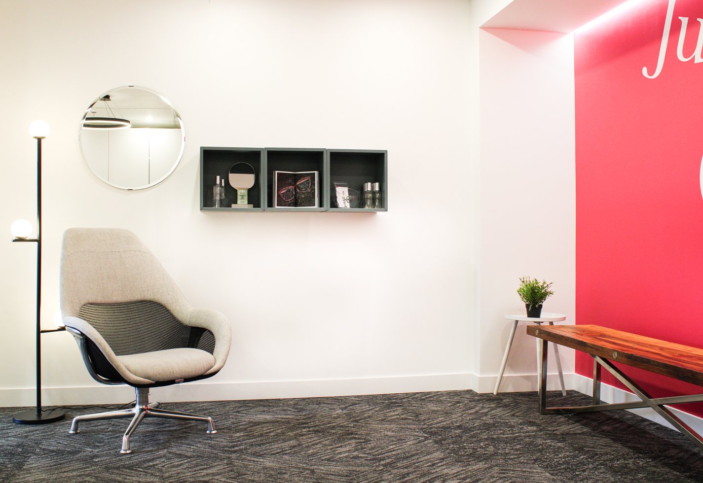
We wanted her space to have the same impact as looking through a kaleidoscope: personalized, delightful, and celebrating the uniqueness of every individual. This concept – particularly the fun and discovery created with a kaleidoscope – inspired specific choices - such as the patterned carpet - and also the overall combination of colours, shapes and textures.
We chose furniture pieces so they felt “collected” as if Rena had gathered the pieces over time to avoid an overly ‘matchy-matchy,’ sterile feel. Instead of choosing all of the pieces from one vendor, we sourced items from 8 different places, using all our ingenuity to find deals at non-traditional vendors of both new and used furniture. Since all of the products were prefabricated instead of custom, it helped with the budget and created the eclectic final result we were going for.
Our People-First Approach In Action
Our goal was to create a smooth office flow, more storage to support the staff, and an excellent experience that made her people feel pampered, understood, and valued. And we did it through every design decision – right down to the thoughtful details that nobody thinks they will notice, but they do!
People-First Decisions
The space was originally wide open, so we created wall separations for an optimized office flow. This creates a better customer experience, including more privacy and less distractions during client appointments.
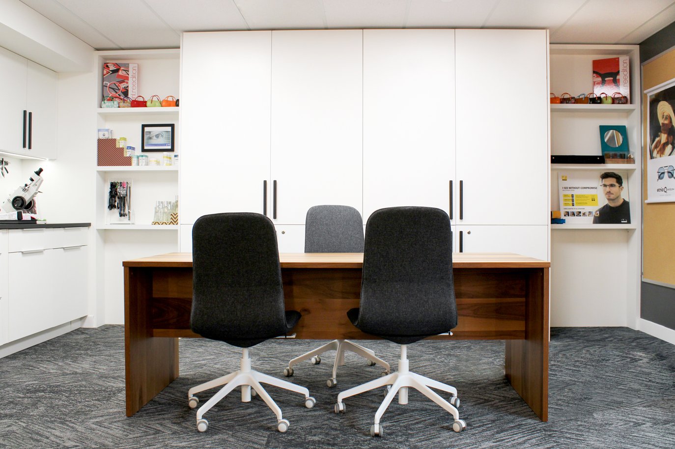
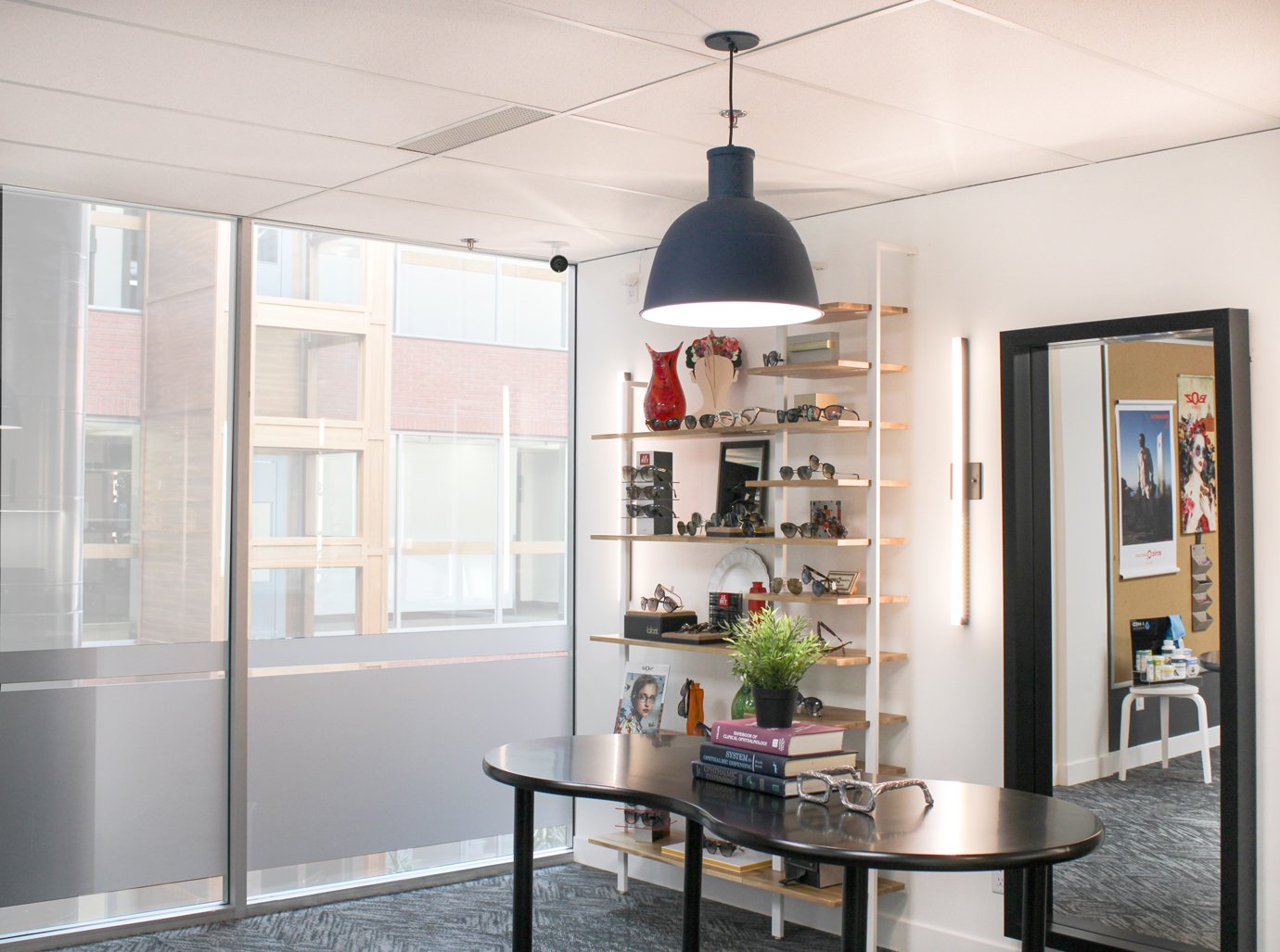
We created a ‘try-on’ (inspirational) area separate from the ‘fitting’ (technical) area. This signals to clients that both the aesthetic and technical sides are being addressed.
The ‘try on’ space is purposefully placed to take advantage of the flattering, natural light from the atrium.
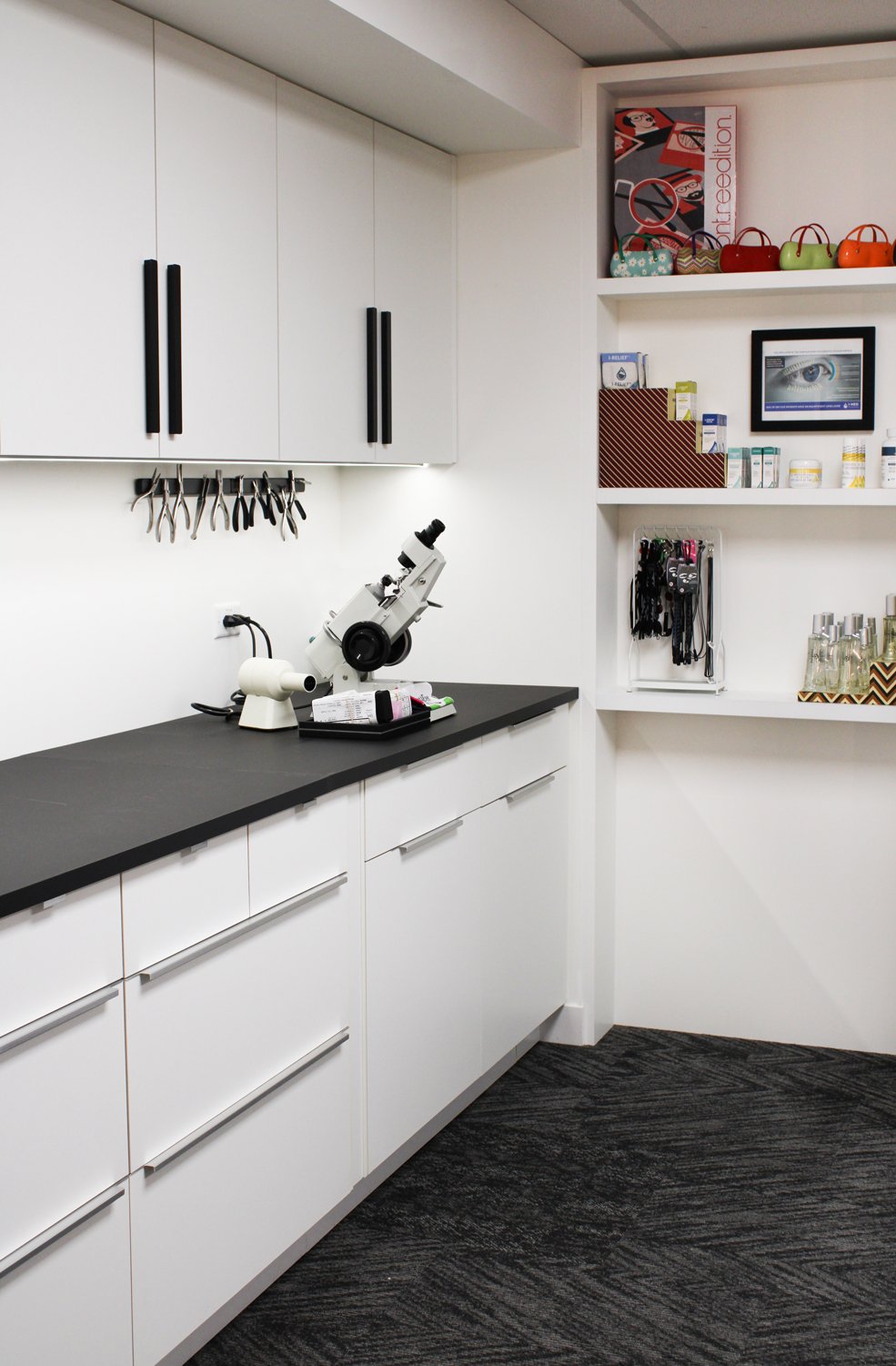
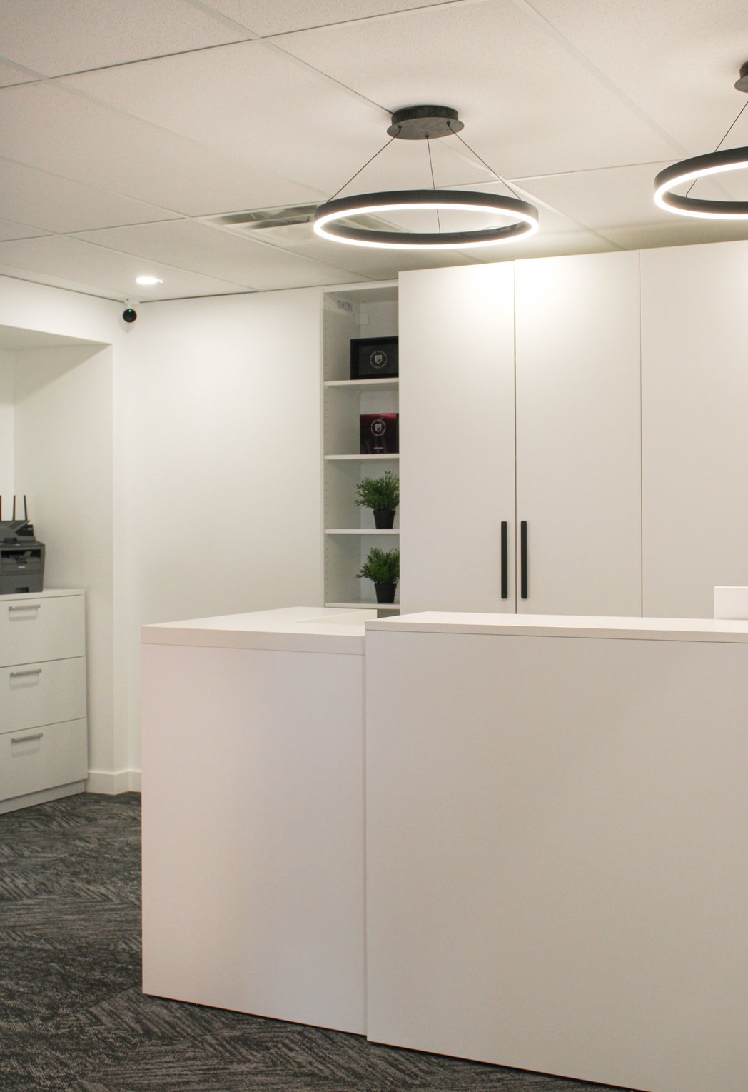
The space is stacked with storage on both sides, providing staff with ample space that they still haven’t fully utilized (a rarity in their previous space).
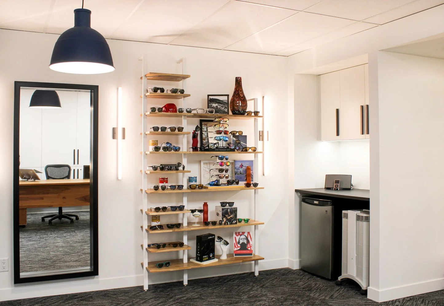
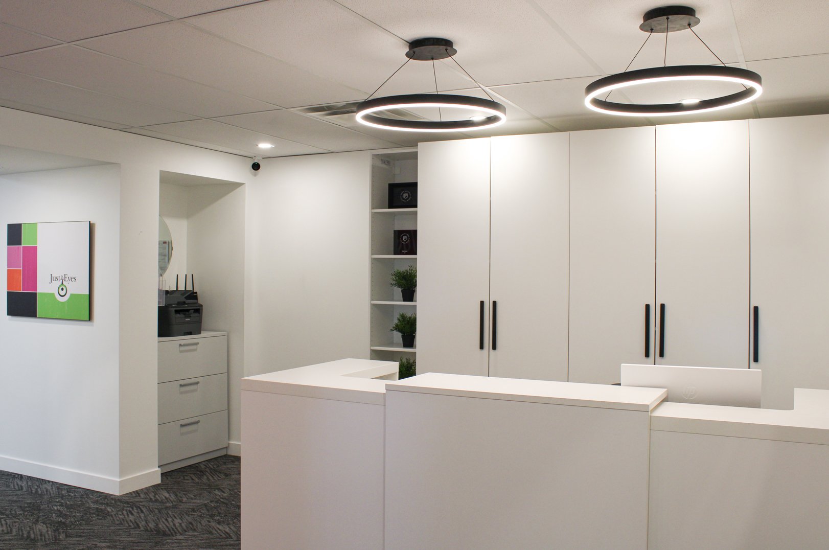
The point of sale display is designed to make products easier to see and more accessible, while the wall-mounted shelves keep items off the desk surface.
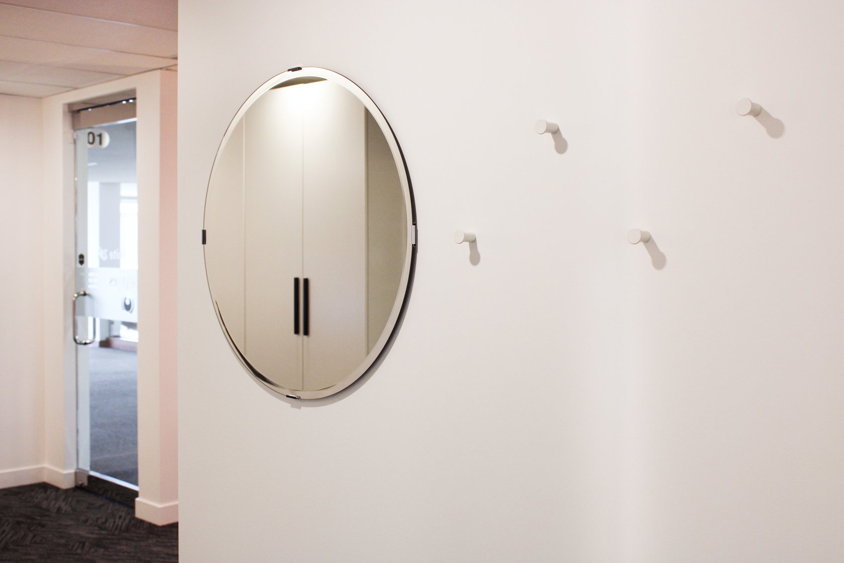
We changed the orientation of the door so it opens to face the reception, instead of the waiting room. This creates a better flow and experience for clients.
“From the initial appointment you listened. You actually listened! And again, your attention to detail was phenomenal. The thing that sticks in my mind was comparing the business to a kaleidoscope, which you nailed. You treated my business like it was your business, both in a design factor (because I didn't want everything to feel too brand new) and in respecting my budget.”
-RENA FAIREY
“The staff and myself love it. The office has flow and function to it, where the old office didn't. Customers say that they love the fact that there is a comfortable reception area and that when they come in to see me for the appointment, it is a separate space with more privacy.”
- RENA FAIREY
Thoughtfully Designed: The Bold Gesture
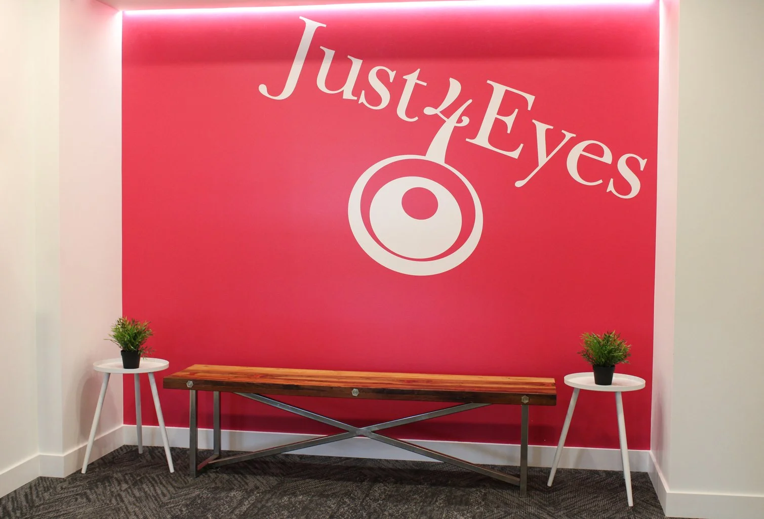
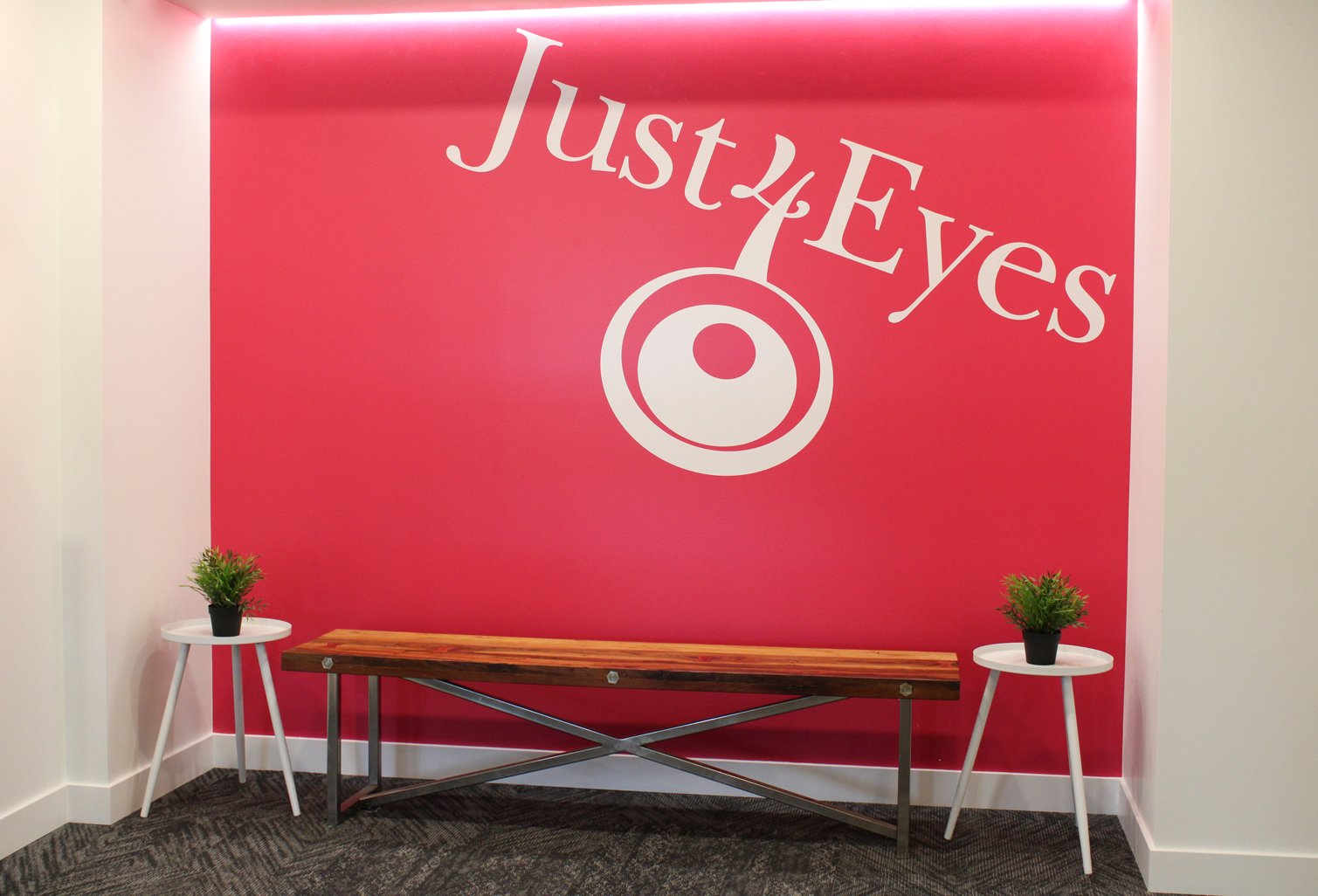
The bright pink wall - a simple yet striking bold gesture in a neutral space. The feature wall was strategically placed in a high-visibility area to serve as an eye-catching beacon for passersby in the public area of the building.
The colour itself was inspired by Just 4 Eyes corporate branding - but instead of using all three of their official colours, we intentionally highlighted just one for that extra bold punch.
ThE EXPERIENCE MATTERS
The experience of working with an interior designer? It matters just as much as the outcome. While working with Rena, we were on her team from start to finish:
We were upfront about what was happening every step of the way.
We problem-solved hiccups with furniture delivery and deficiencies, her property manager, and contractor.
We went above and beyond to respect her budget while still delivering on her authentic vision.
“I really appreciated that you oversaw the construction of the office with some challenges both from the property management and contractor - and the end result was fabulous. Your communication with me was phenomenal. There were never any communication gaps - you were always letting me know what was happening at each point in time through the whole process.” - RENA FAIREY


