Peyton Design Client Story
Standout Space: PILLAR CAPITAL CORPORATION
WORK, LINGER & HOST - A Savvy Financial Hub That Does It All
When we think ‘Pillar Capital’, we think ‘bucking the norm’ of the traditional financial industry. So when we were tasked with defining a design strategy for their new commercial space, we couldn’t wait to dig in!
This boutique ‘alternate financing’ company had quickly grown large enough to take on their first solo office. And their new suite (previously used by family lawyers) came with dated interiors, tight corridors, and a choppy layout - quite the opposite to the vibe they wanted to create. So we did what we do best: created an inviting space that completely reflected their truest brand.
“We found Peyton Interior Design to be extremely approachable and collaborative. Kerri is an incredibly thoughtful yet active listener. SHE did an amazing job of transforming our space and giving us a beautiful home for our company that we can grow into over the next 5+ years.”
- THE TEAM AT PILLAR CAPITAL
Authentic & Aligned Design
Our initial inspiration came from the classic film “It’s a Wonderful Life” (which also happened to be the co-owner’s favourite movie!). This pop culture reference – specifically the ‘good guy, banker’ main character George Bailey – set the tone for the workspace that we created.
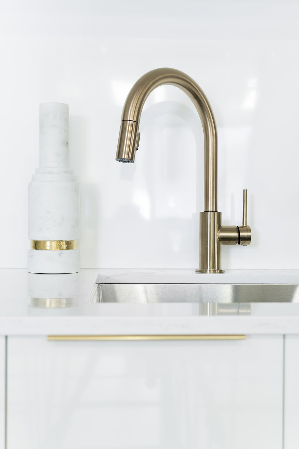
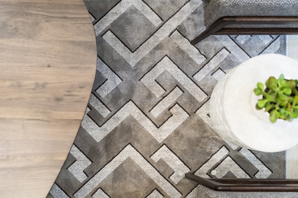
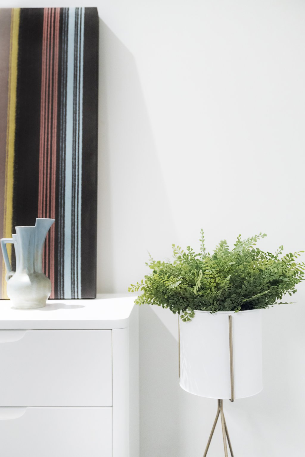
We reflected Pillar Capital’s non-traditional approach by juxtaposing vintage and modern elements, rich textures (like wood and brass), and incorporating an approachable, hospitality feel despite its setting within a traditional office tower.
Our People-First Approach In Action
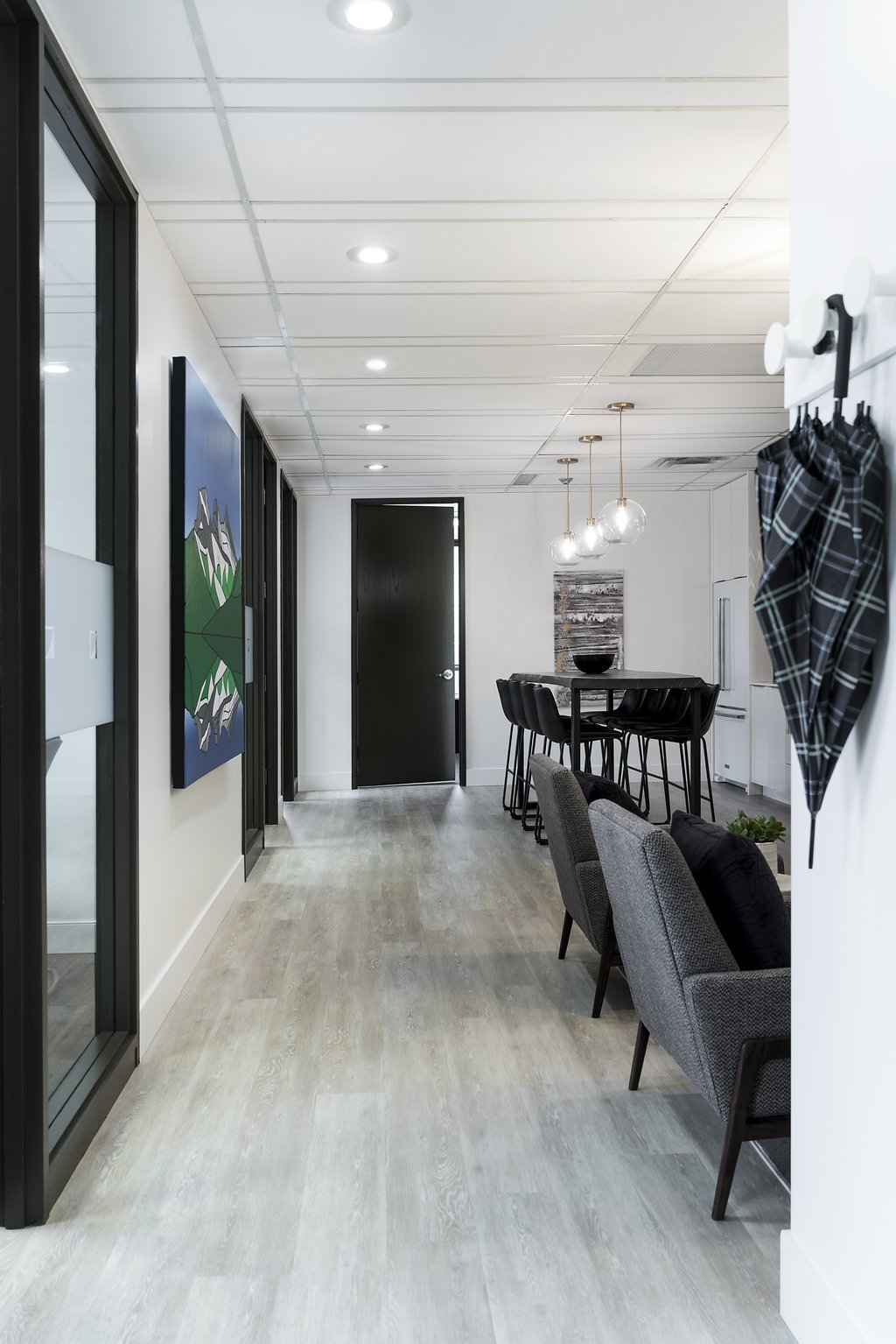
Pillar Capital needed to differentiate itself from the usual formal, traditional financial experience - which is why we opened up the space by taking down walls to create a more natural flow. Through careful space planning and special lighting and furniture, we created a space to not only work, but to linger and host colleagues and high-profile clients.
People-First Decisions
The floor plan struck a healthy balance between collaboration and individual work. We created a sense of ‘openness’ throughout the space, while balancing it by maintaining the private offices around the perimeter.
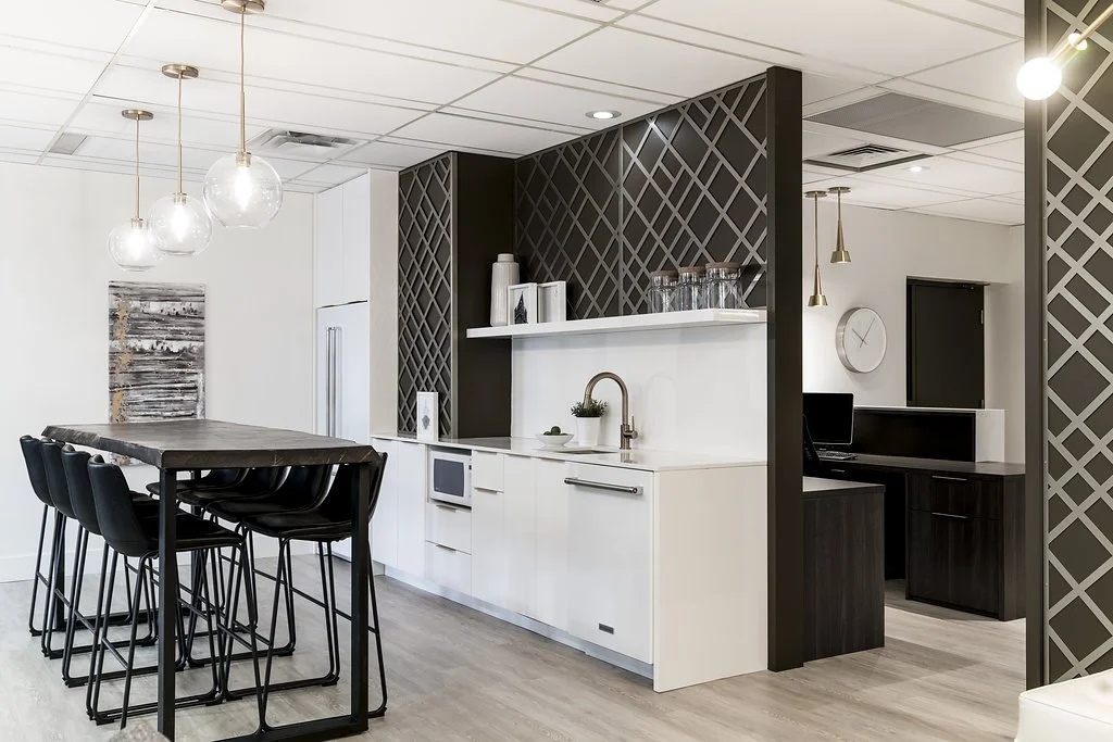
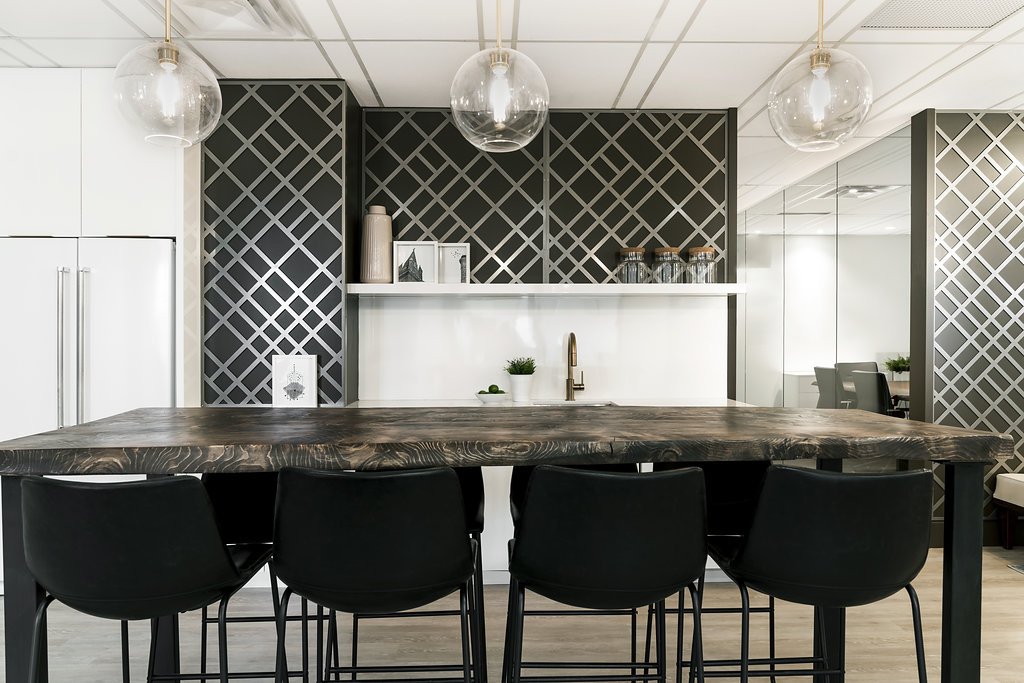
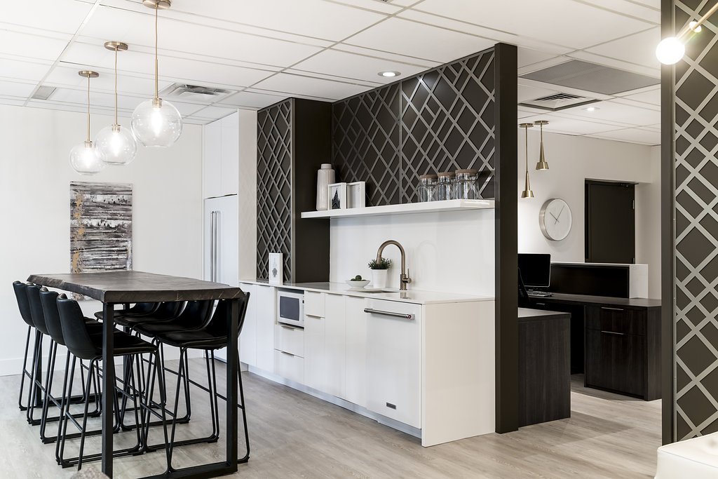
We created a flexible, multi-purpose lounge space where staff can work, eat, or entertain. The kitchen and lounge can be used separately, or combined for larger events.
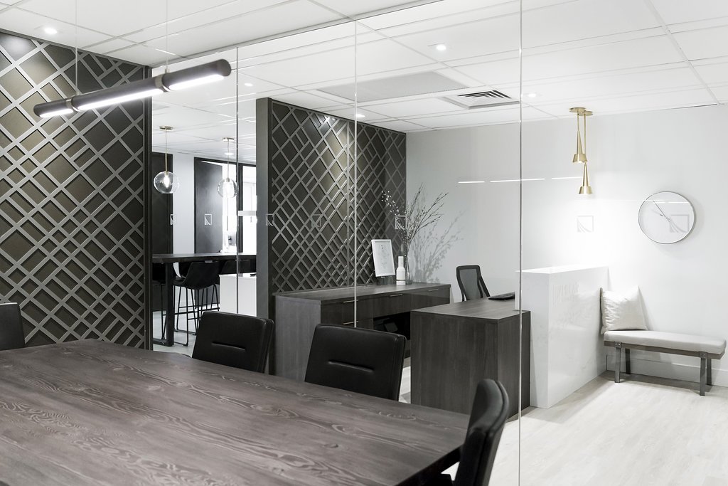
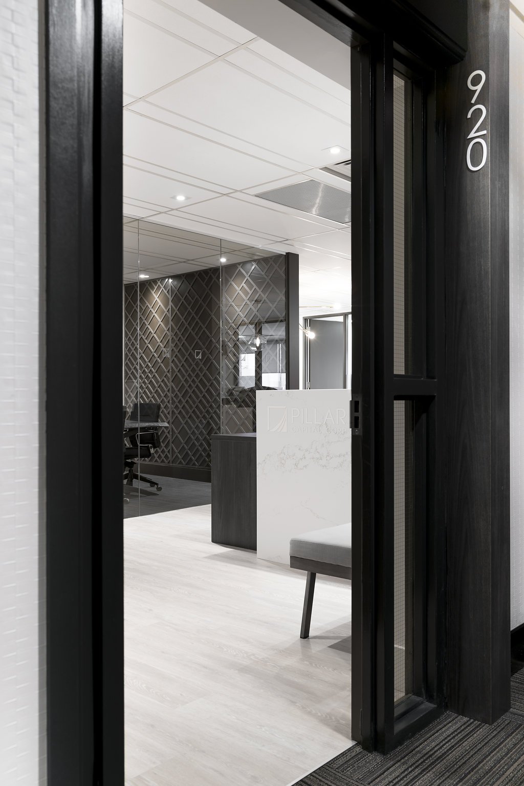
To make the compact space more welcoming for clients, we opted to maximize sightlines, removing barriers and giving clients a peek into the more interior spaces from the reception area.
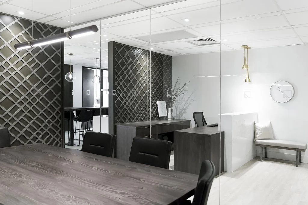
We took down the level of formality by enclosing the boardroom with glass walls instead of solid ones.
Originally, we wanted to revamp the front door to make it more grand - but when we dug a little deeper, we found out that it wasn’t structurally possible. As a second solution, we created a custom millwork frame which incorporated the suite number, to set the tone and draw people in from the public corridor.
“Kerri brought [the theme] to life for us in a way that was so much better than what we imagined.
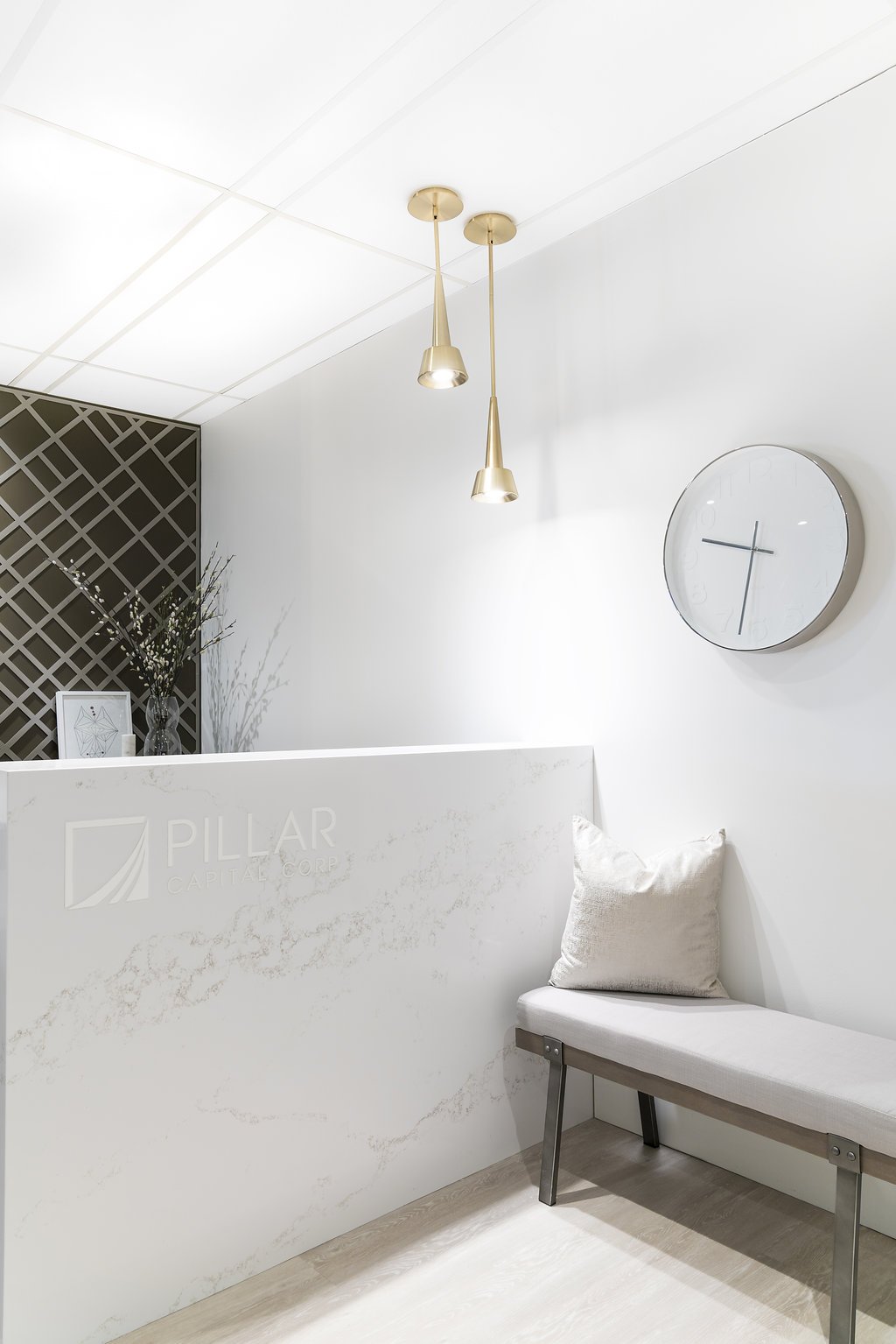
Kerri also came up with several unique ideas like our waterfall reception desk, which is also a full work station; full glass feature wall for our boardroom with textured wallpaper and brass metal feature wall; usable flex space for our staff to live, work, eat and entertain.”
- THE TEAM AT PILLAR CAPITAL
Thoughtfully Designed: The Bold Gesture
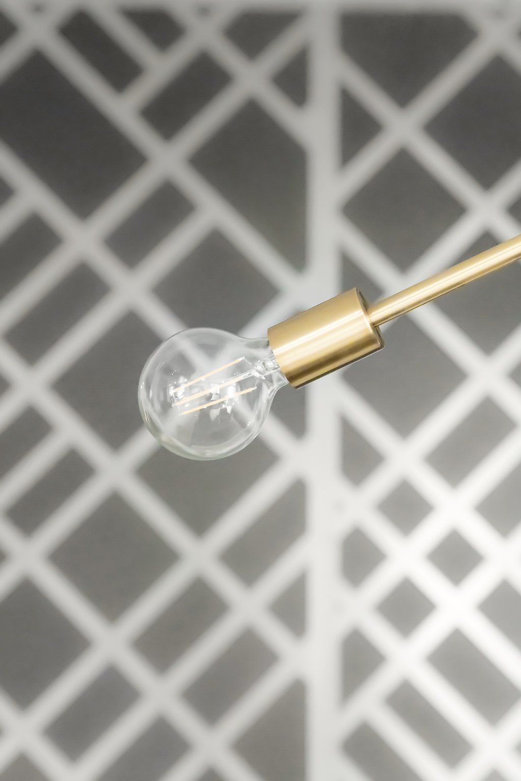
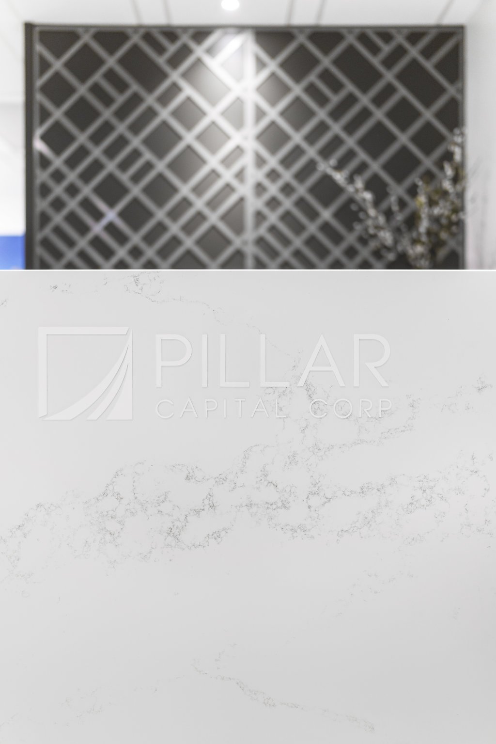
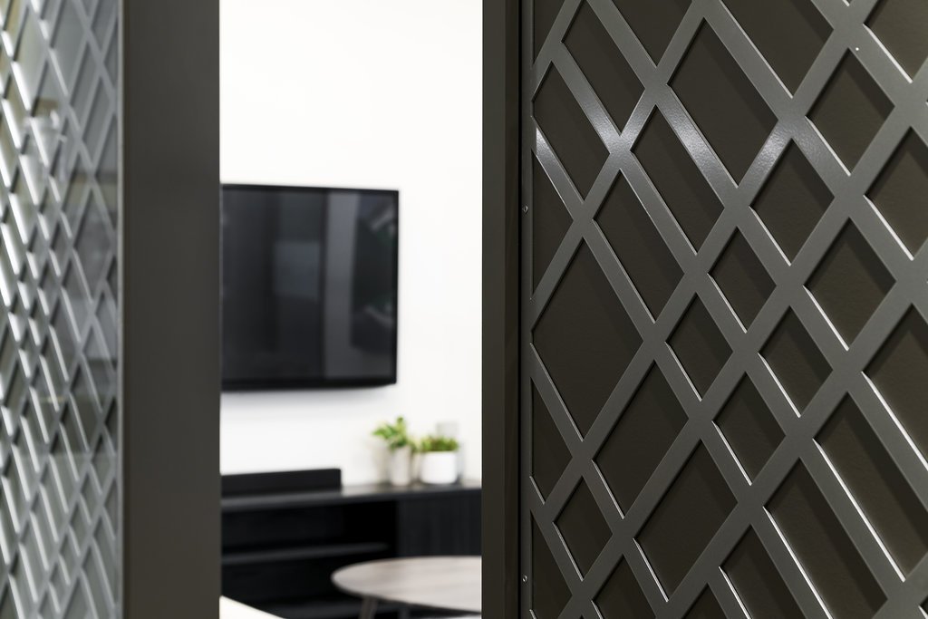
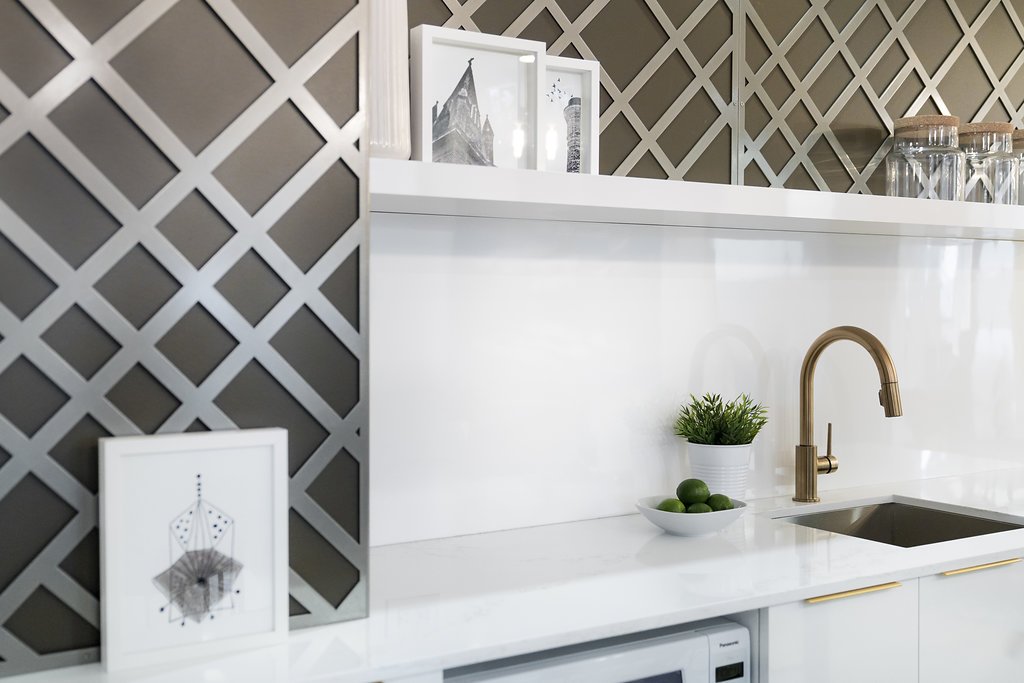
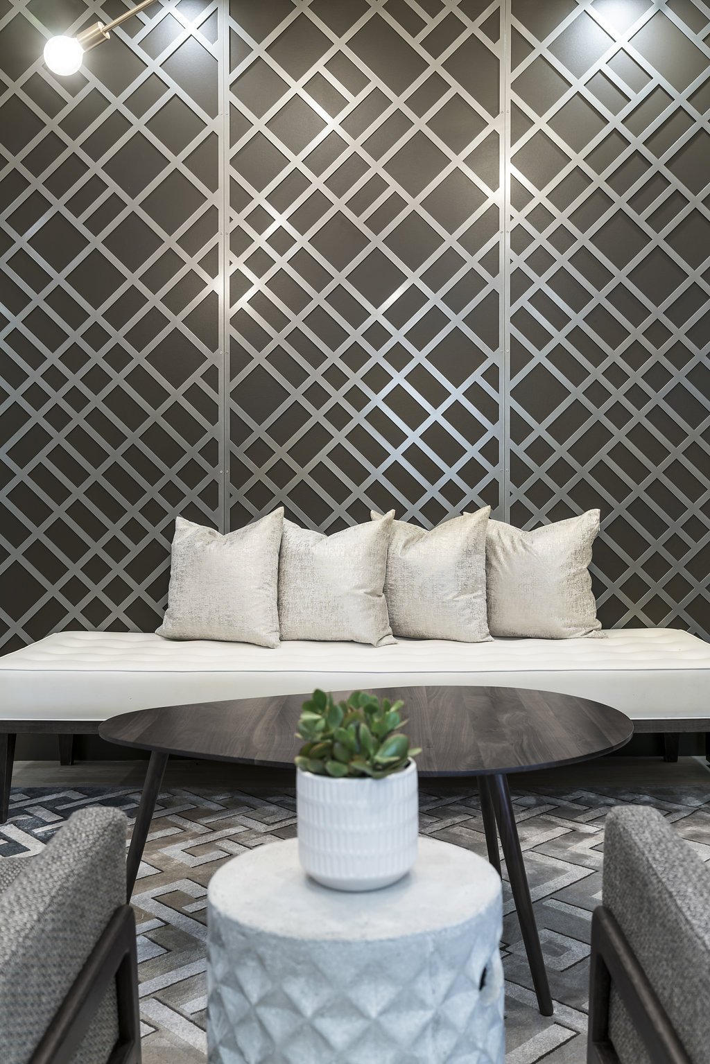
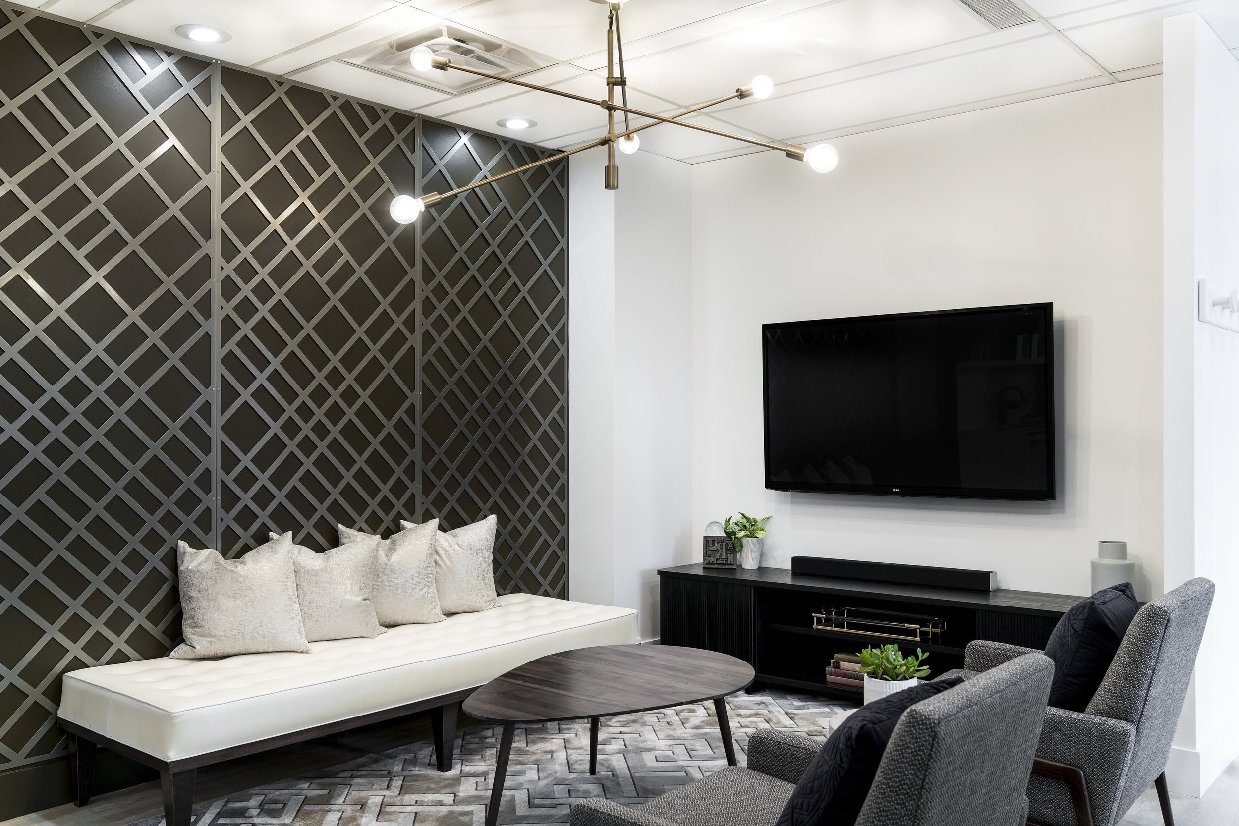
Custom-designed metal panels were the perfect bold gesture for Pillar Capital. Inspired by vintage bank teller screens from “It’s A Wonderful Life”, this notable design detail created an anchoring slash through the centre of an otherwise neutral space. The feature imbibed a welcoming, casual feel while still keeping within the financial institution reference.
We intentionally designed a ‘double-sided’ wall to be installed mid-space. It’s visible from everywhere – the reception, kitchen, and lounge area – to give the entire office a fresh, crisp vibe.
ThE EXPERIENCE MATTERS
Bold ideas – like the custom wall feature – come with many technical challenges, and you need the right design team on your side to create solutions on the fly.
In this case, the first challenge was finding and then coordinating with the metal fabricator to strike the right balance between intricacy and cost (which we did!). The second challenge was around functionality - ensuring the panels were created in a size and shape that could be transported in the older building elevators, and coordinating between the contractor building the space and the artisans who created the screen.
Now, our client continues to benefit from a custom feature and distinctly branded space that’s unlike anything else out there.
“Thank you again for all your help making your vision for the Pillar Capital space a reality. You [created] an attractive and functional design - the theme was perfect for us. And you were a proactive problem solver until the project was completed.
We’re thankful that we trusted you with our unit. We would be happy to recommend you to anyone looking to renovate their space.” - THE TEAM AT PILLAR CAPITAL


