Peyton Design Client Story
Standout Space: SUMMIT CHIROPRACTIC
Wellness With a Cozy Hint of ‘Apres-Ski’
Our client was at a pivotal point in her journey of creating a wellness destination. With her new commercial space, she was faced with a blank slate of potential…but also with tight square footage. When she first signed up for the space, she struggled to envision a functional floor plan – one that would achieve her business goals and meet the needs of practitioners – while also maintaining a cohesive brand story.
That’s when she found us! She enlisted the help of our interior design team to bring her brand story to life with thoughtful functionality, smart space planning and original design. And we couldn’t be happier with the end result: a comfy, welcoming space that supported her clients’ healing and her corporate branding.
“I’m extremely satisfied [with the final design]! I love my space and so do all my patients. We get multiple compliments a week.”
- DR. NICOLE KASPER, OWNER OF SUMMIT CHIROPRACTIC
Authentic & Aligned Design
We love bringing organic stories to life through design (especially ones that support the bottom line!) and Nicole’s space was no exception. Nicole herself was a competitive athlete before entering the field of chiropractic care. Playing off of her story and the idea of reaching the ‘Summit,’ we envisioned a healing space inspired by a cozy ski lodge to rejuvenate and recover when the body needed it most.
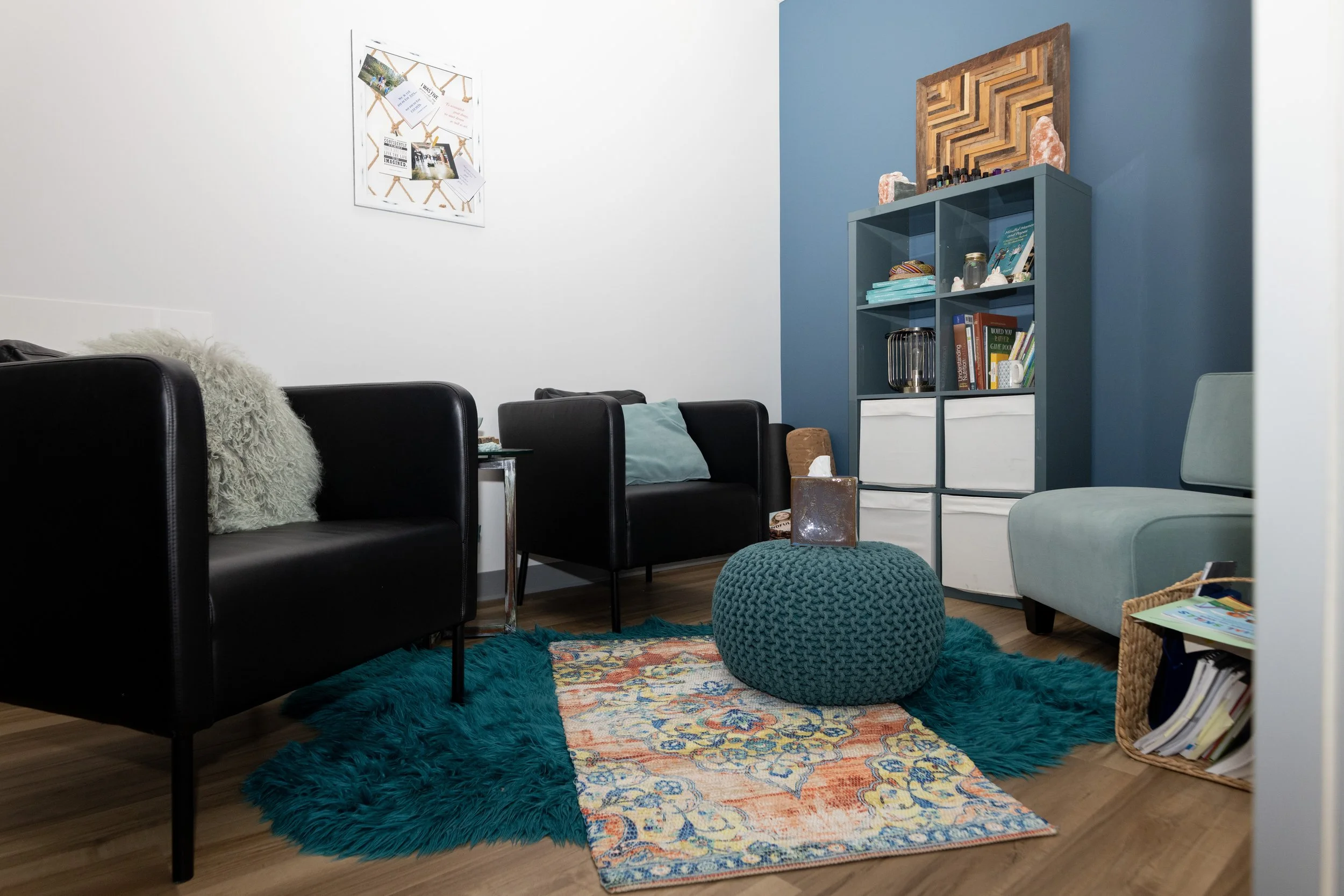
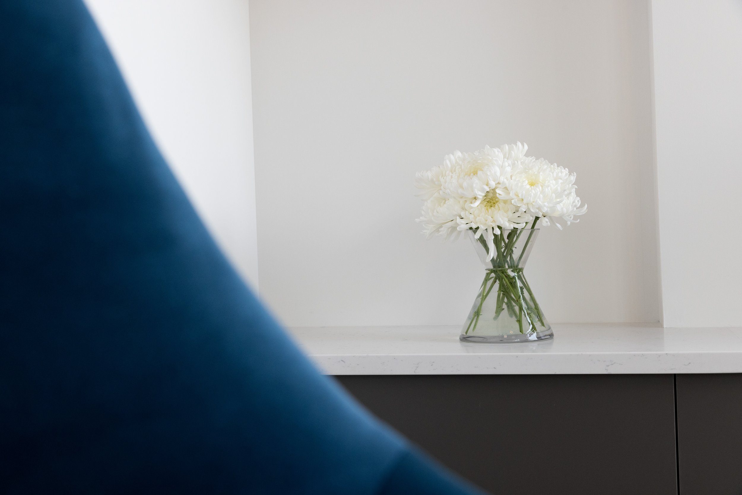
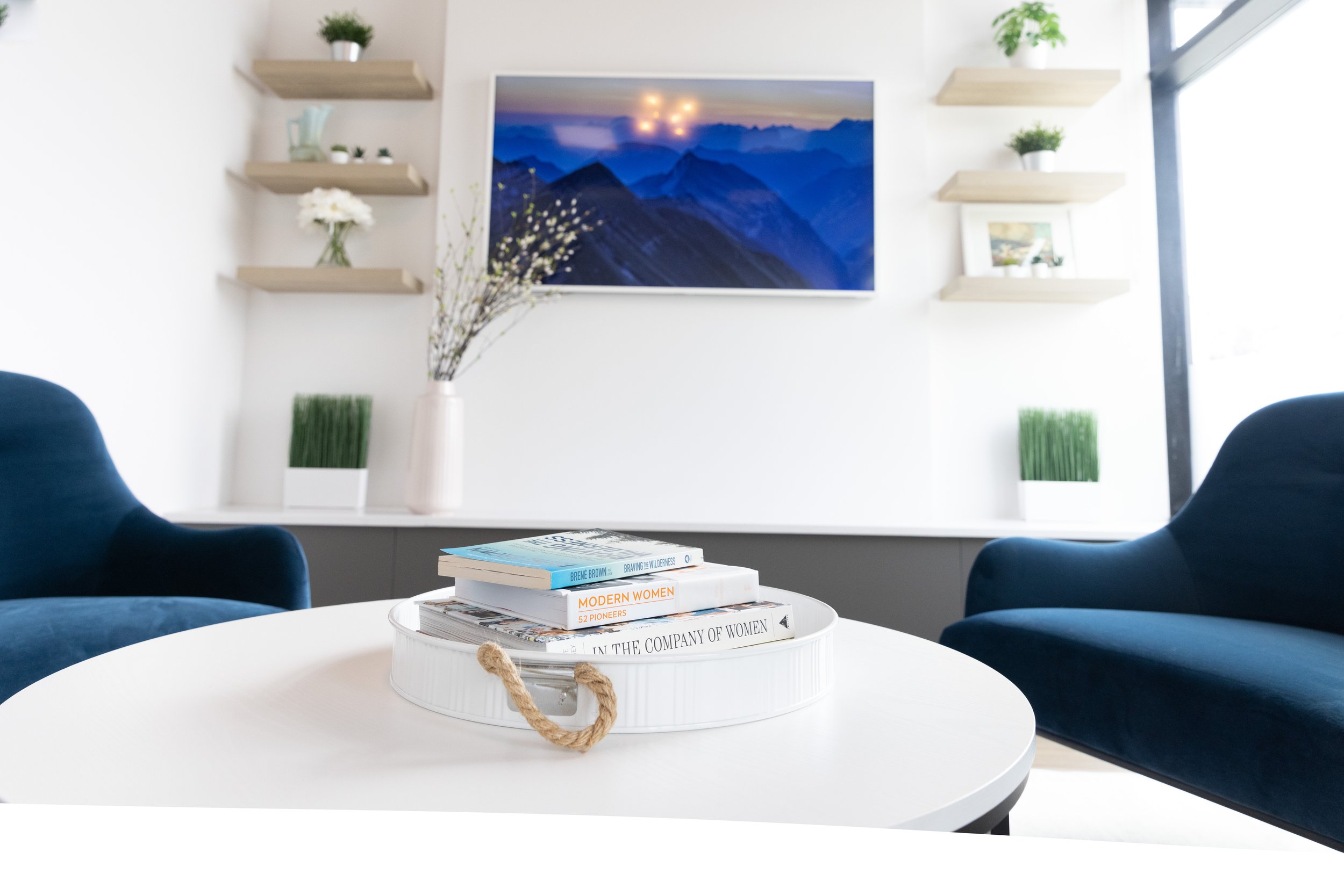
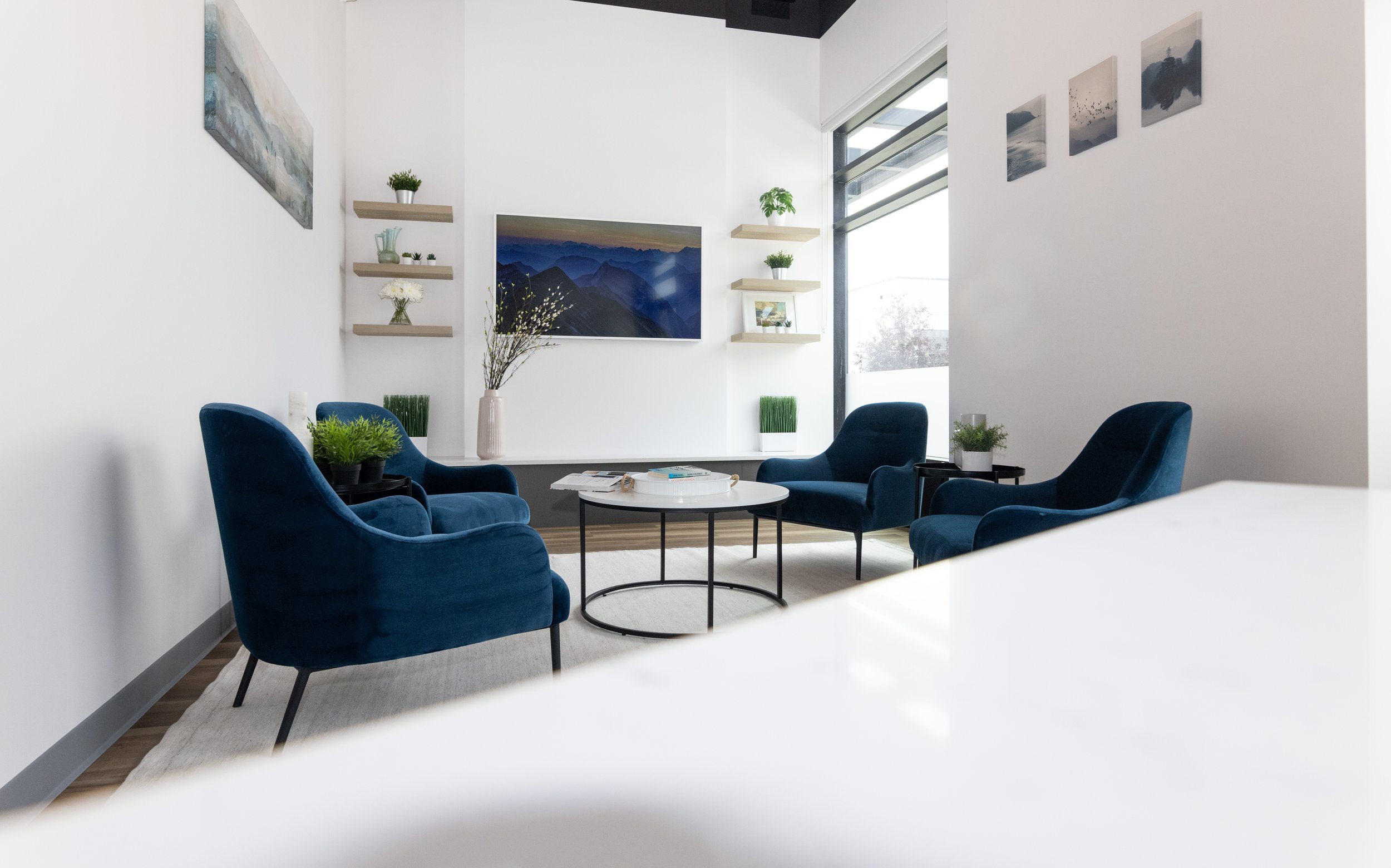
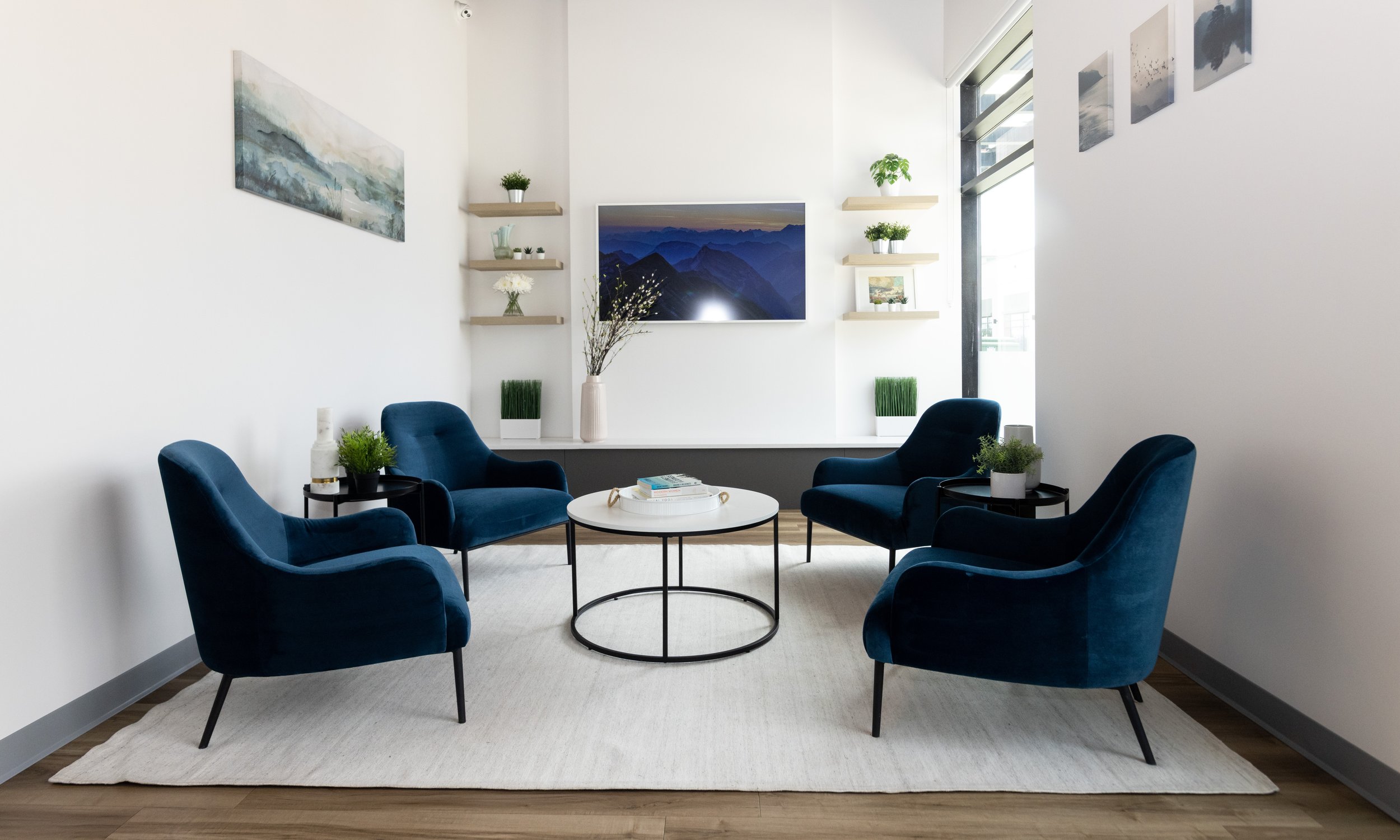
Although we kept the ‘ski lodge’ reference subtle, it was translated into small, impactful details throughout the space: a focal wall in the waiting area that mimics a fireplace, comfy chairs to relax into, and wood and stone finishes combined with refreshing greens and blues, reminiscent of the natural mountain beauty.
Our People-First Approach In Action
People are the heart of every space that we design - especially when it comes to wellness. Multifunctional rooms, a consistent aesthetic, and optimizing every inch of the floor plan are among the people-first decisions that we made for Nicole’s space.
People-First Decisions
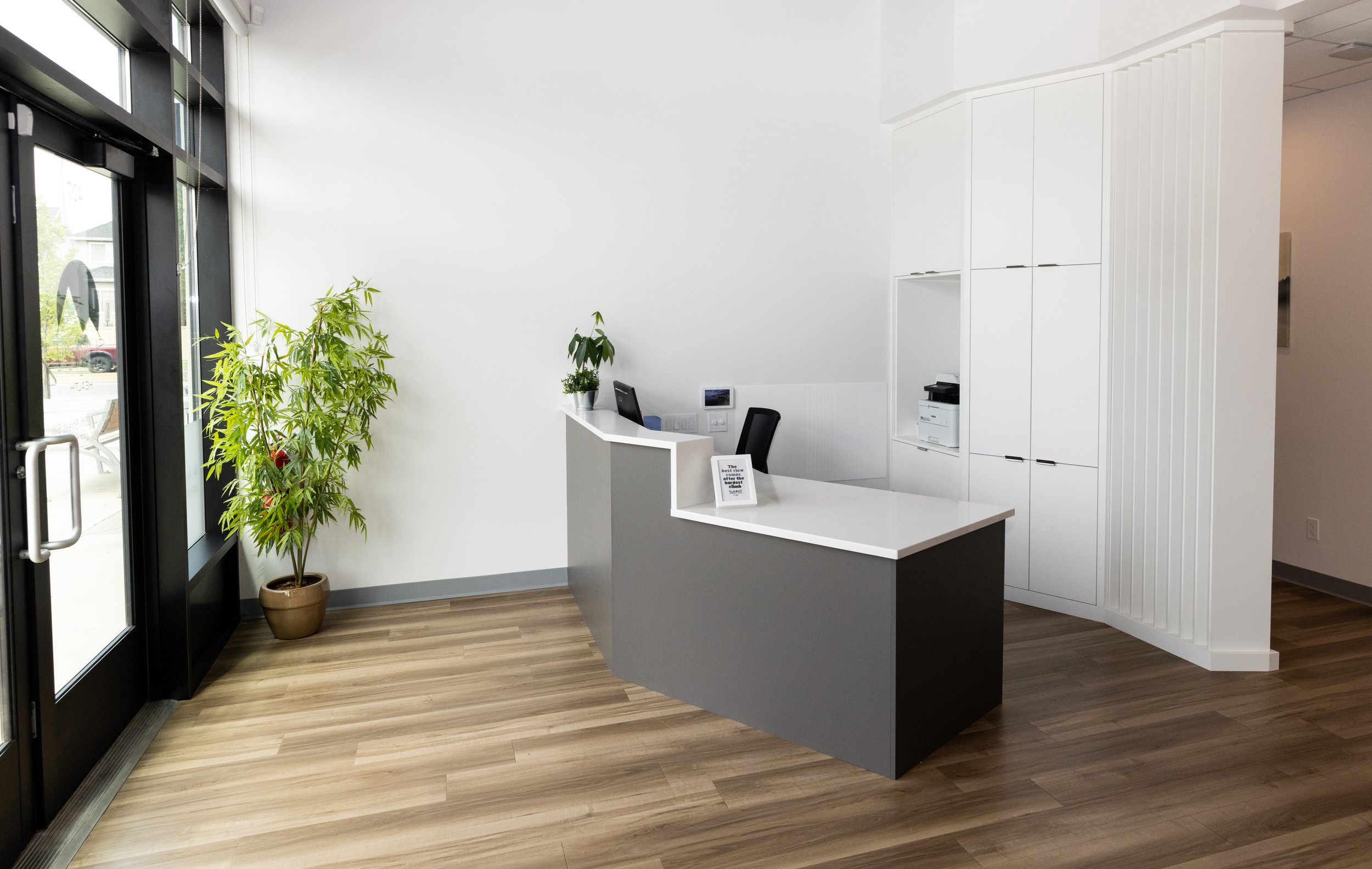
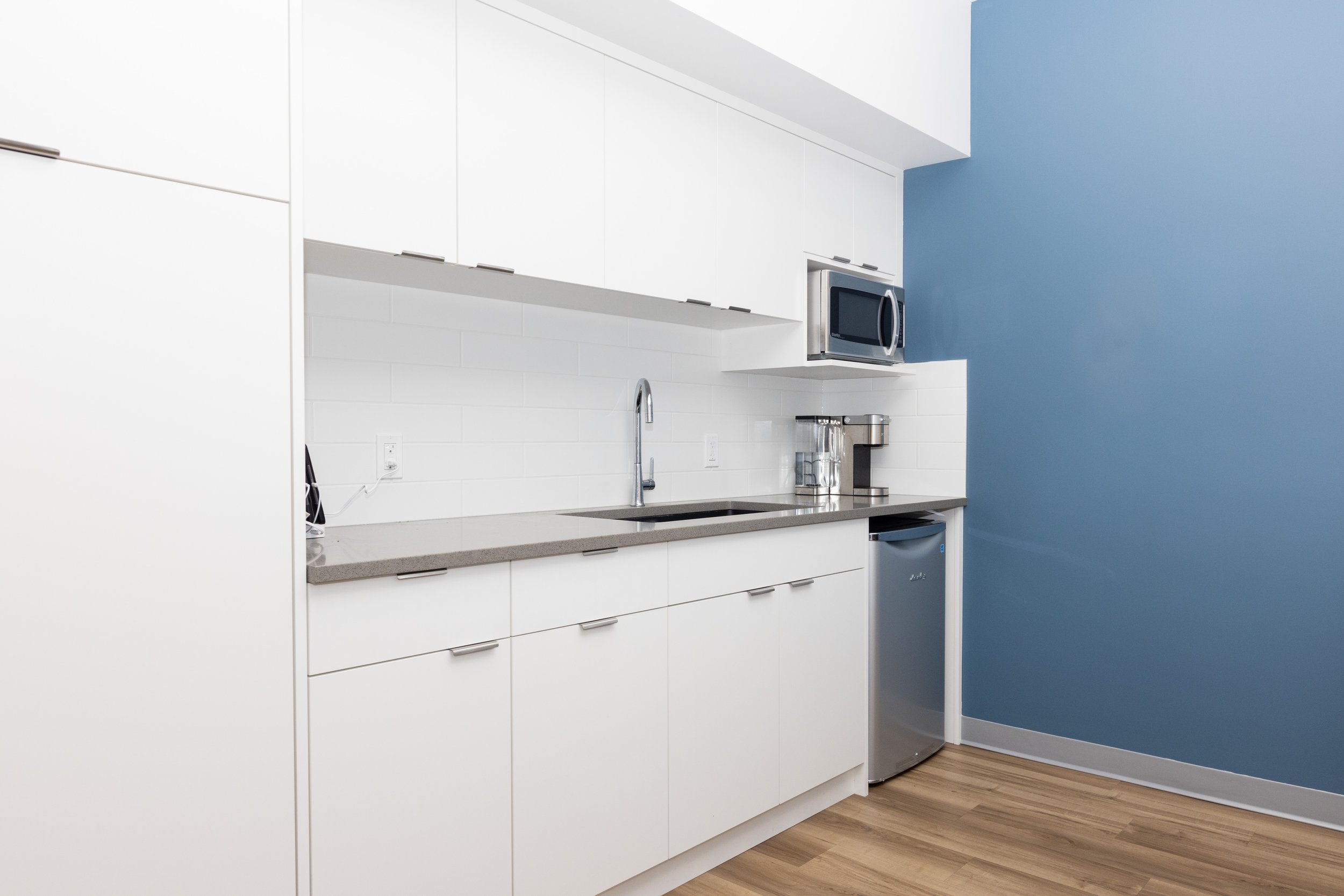
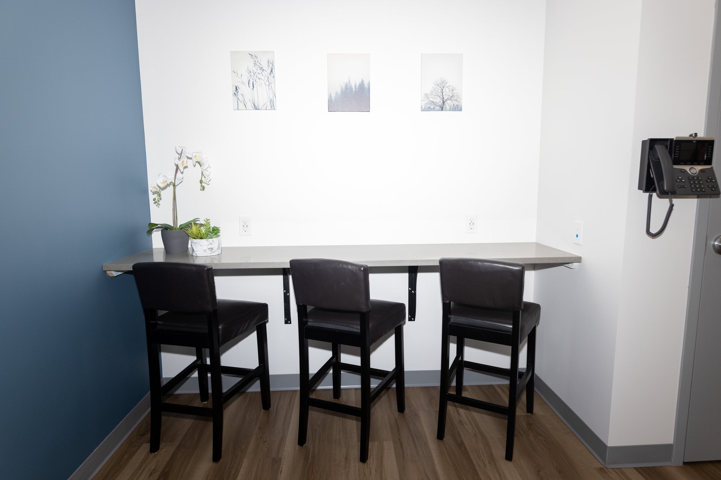
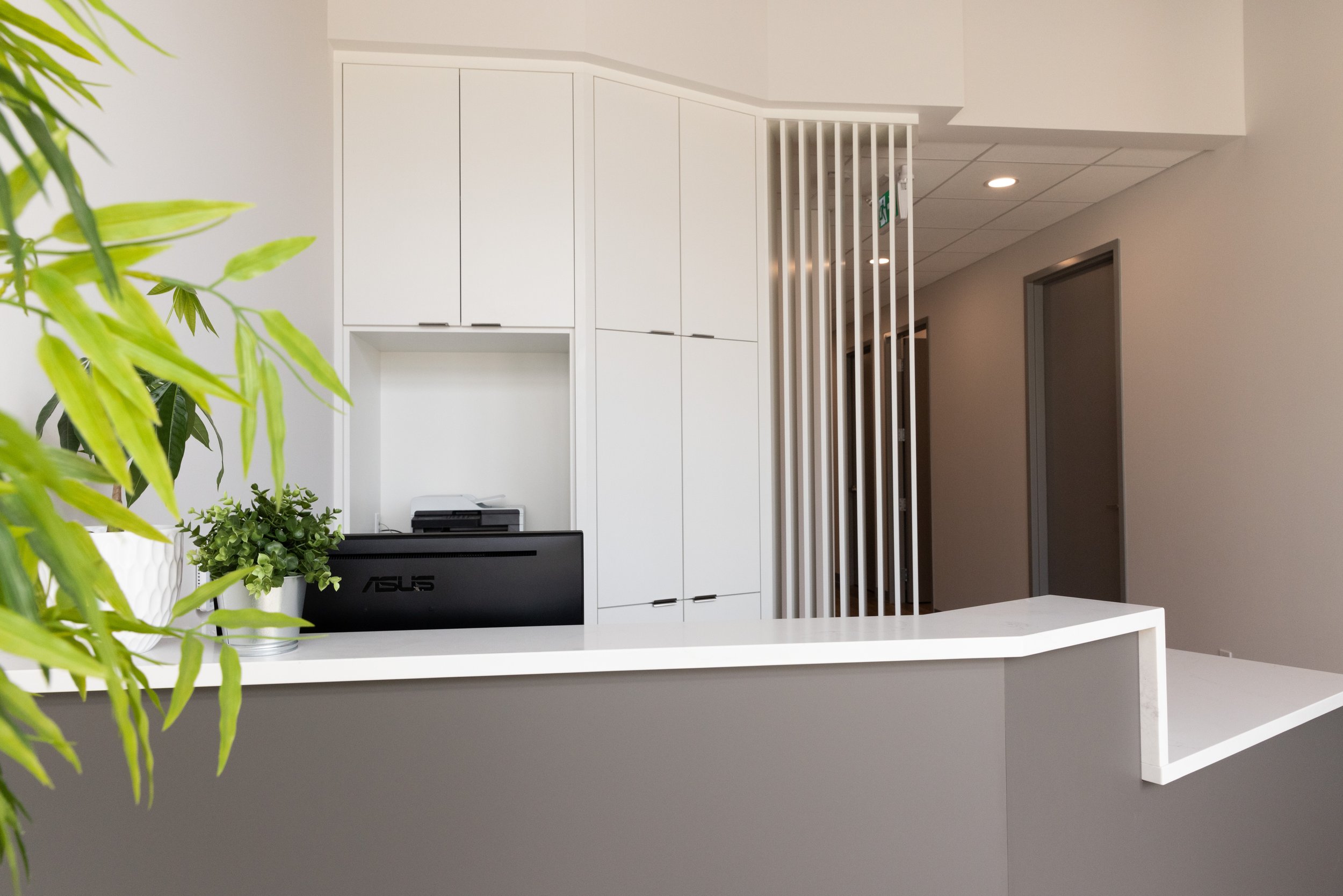
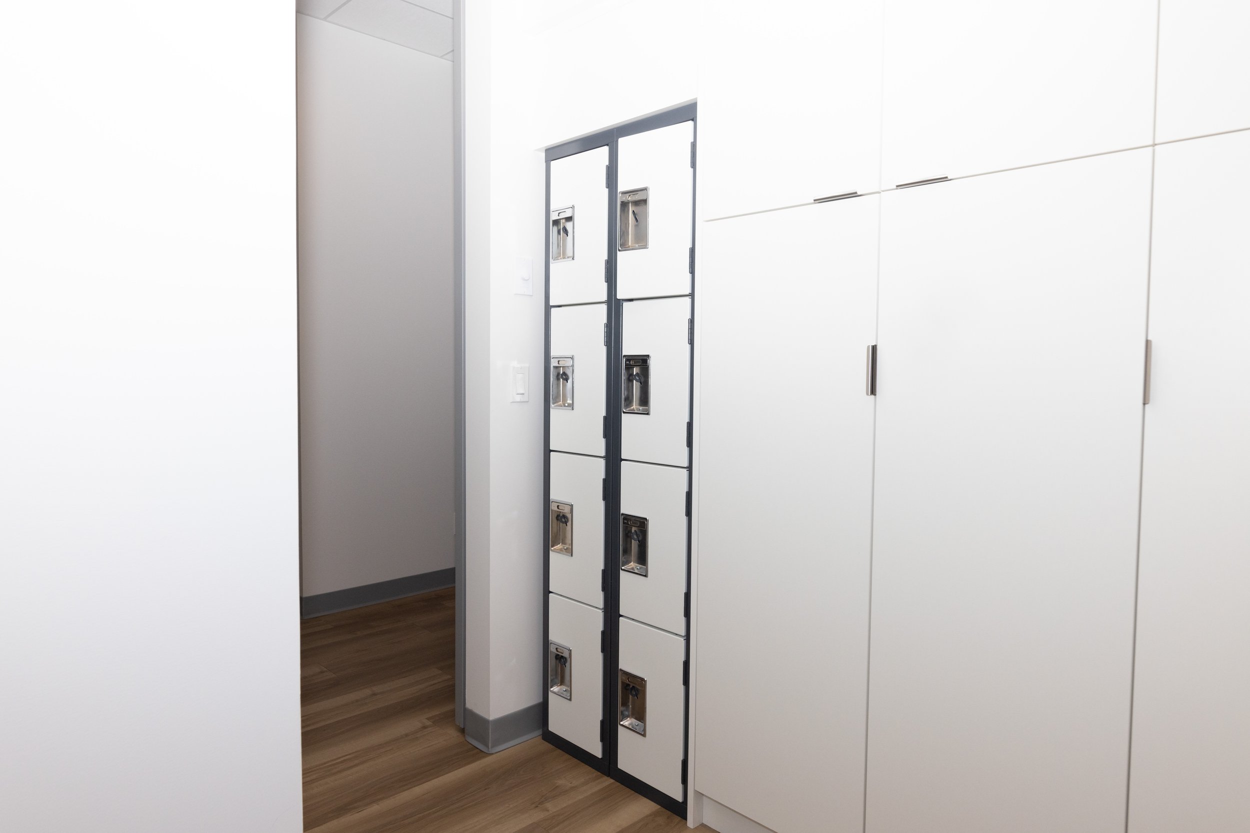
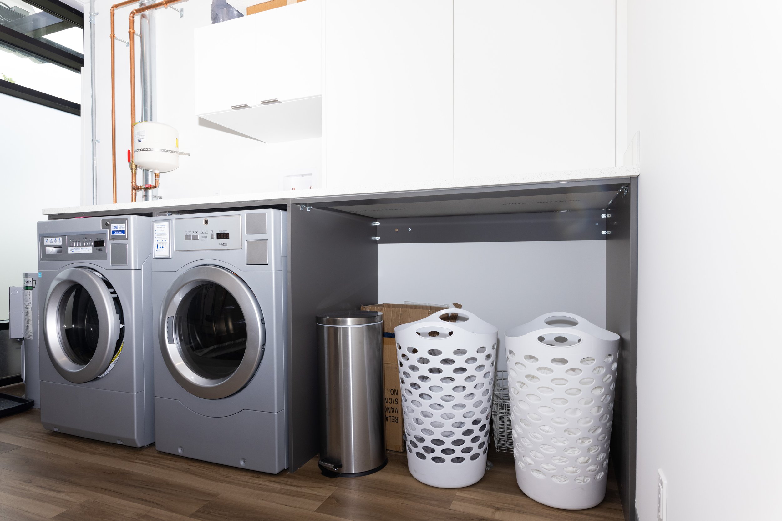
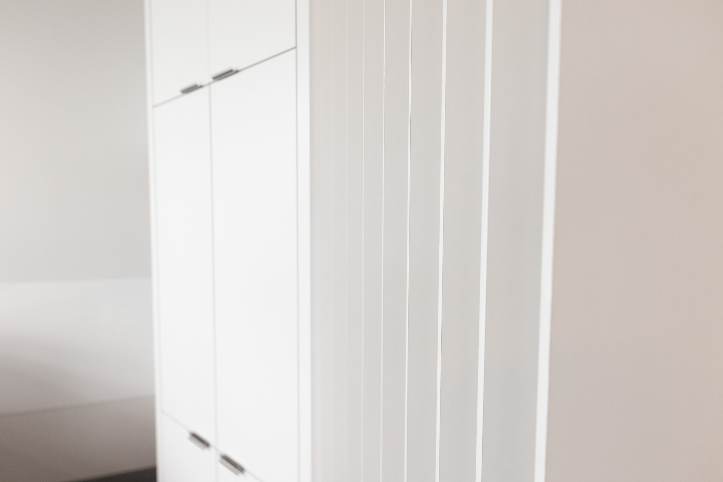
Since we were working with limited square footage, space planning was especially important to support the staff in the day-to-day. We designed an easy-to-organize laundry room to launder and store the 200+ bed sheets that were used daily. The staff kitchen was kept compact but extremely functional through built-in storage and a flexible work surface. Plus, the reception desk was designed to fit two people, to accommodate future growth of the front desk staff.
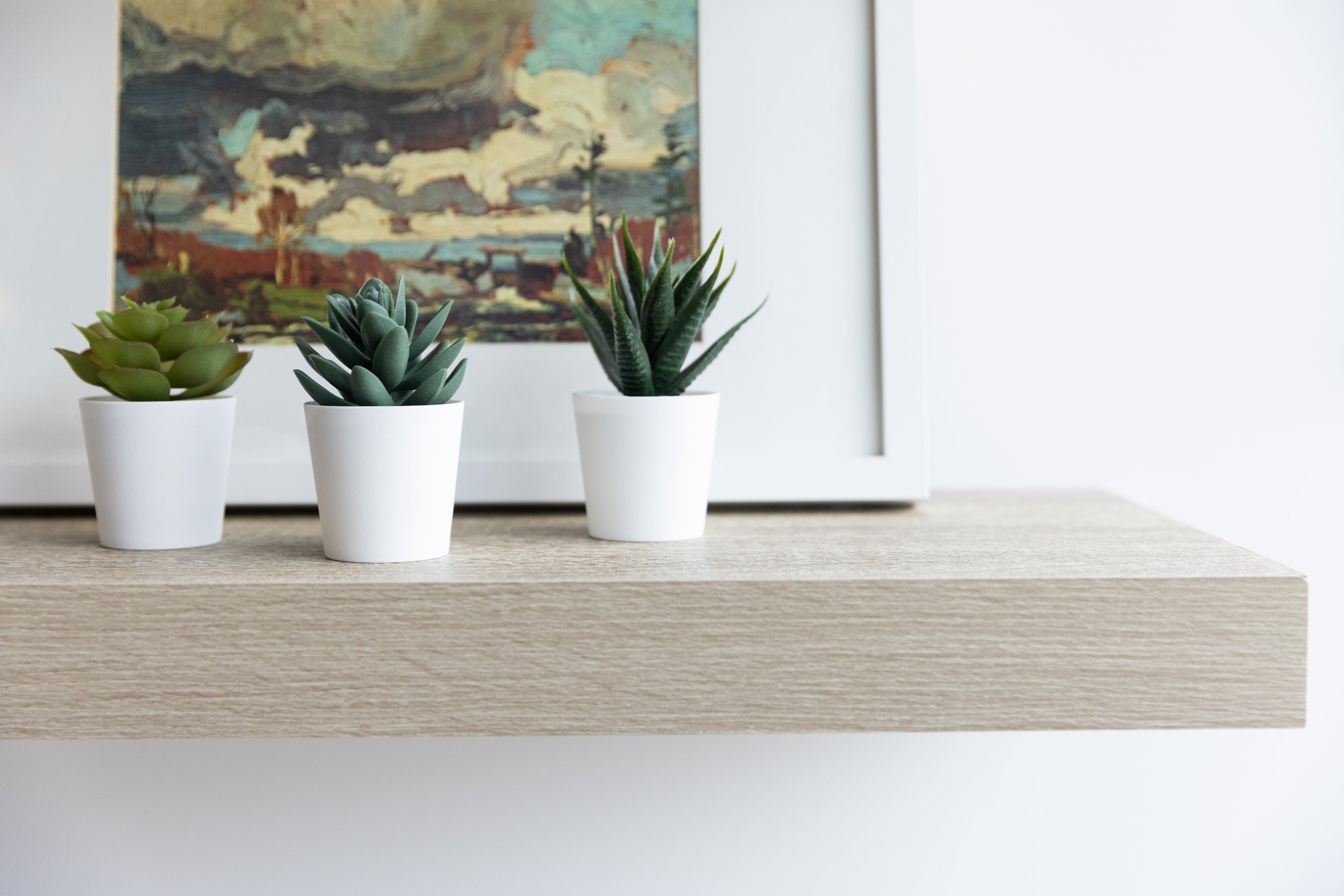
The entry/waiting area was designed to be multi-functional and second as an event space to host community gatherings. Since its primary function was to keep clients comfortable, we added shelves for retail products to be displayed, cozy chairs, and a screen for entertainment. On top of that, we made sure it could be reconfigured to accommodate a speaker and extra folding chairs for community events.
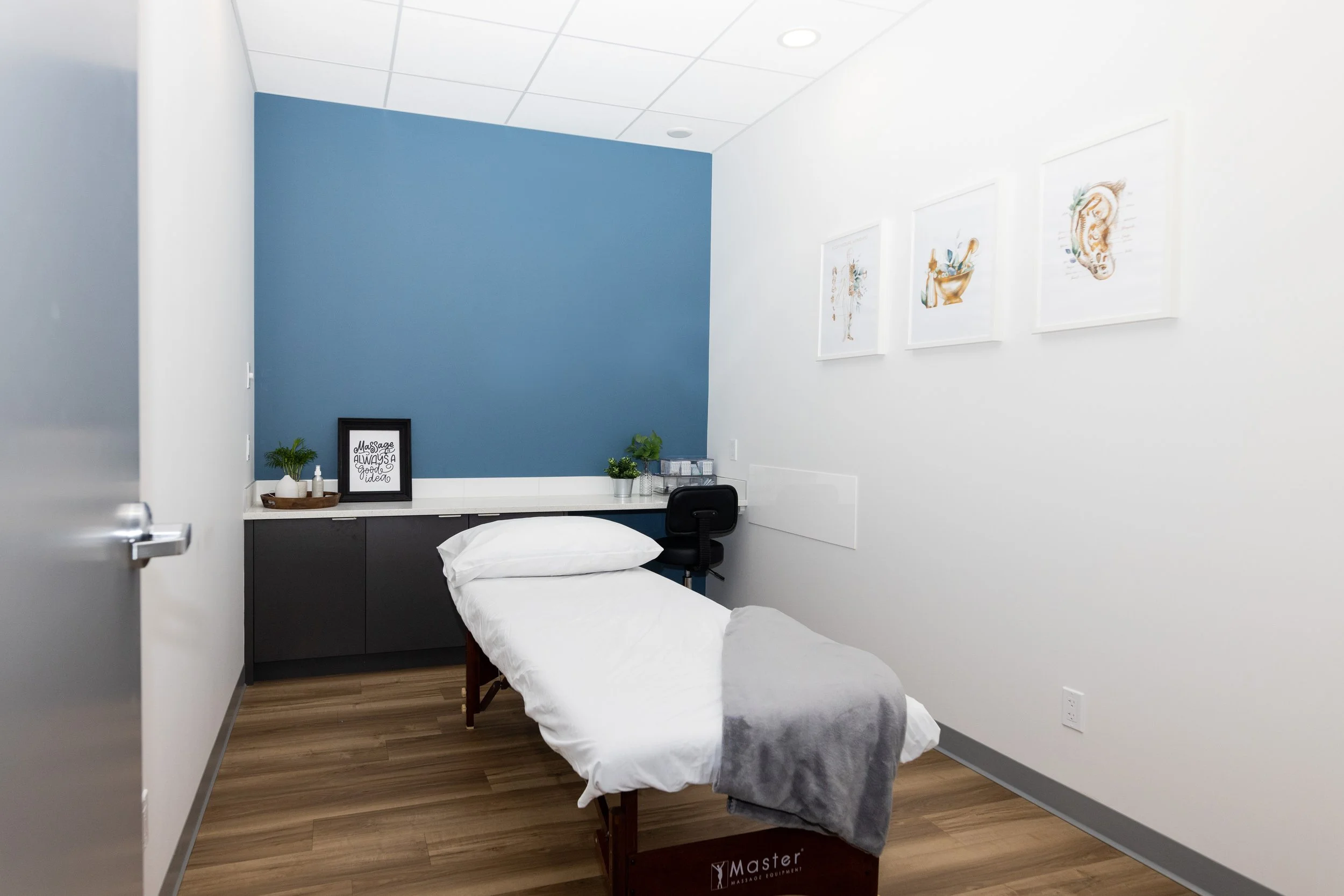
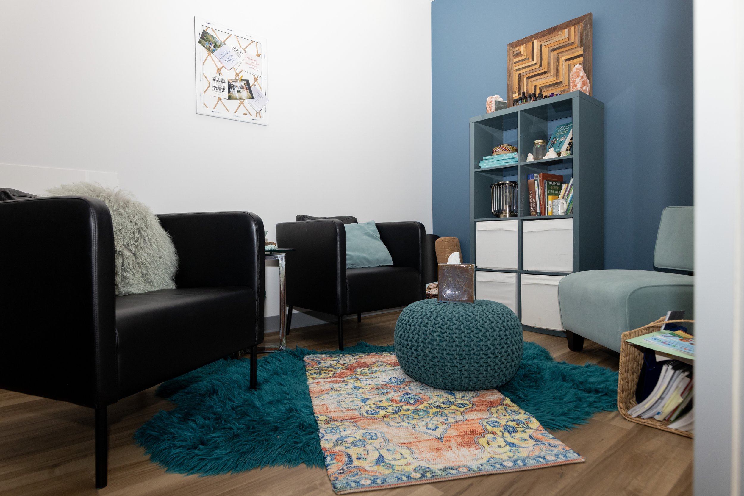
We designed the treatment rooms to be flexible and functional for various types of practitioners, from child psychologists to massage therapists.
“What Peyton Interior Design does really well is making the space fit the person/company and help them represent the image they want to. The vibe of my space was exactly what I wanted it to be without having to explain it multiple times.”
- DR. NICOLE KASPER
ThE EXPERIENCE MATTERS
The design process is full of the unexpected highs and lows and most business owners – especially first-timers! – don’t know what to expect. That’s why we’re here. To be the experts, advocates, and support that you can lean on when things get overwhelming. Here’s how we helped Nicole through the process:
We successfully applied for a building code relaxation around the required number of barrier-free washrooms. This freed up valuable square footage for her already limited space.
Since the treatment rooms were to be leased out, Nicole originally wanted to keep them as basic as possible. Instead, we proposed a solution that was better for her business by keeping practitioners and patients top-of-mind. We ended up creating fully functional treatment rooms – with functional millwork and an attractive aesthetic consistent with the corporate brand – to stand apart from competing wellness practices.
“Your team helped me feel more comfortable and at ease with the process. I am a control freak but had to give up control for most things during the process as I had no understanding of how things worked. And I felt pretty comfortable giving you control and letting the team help me.” - DR. NICOLE KASPER


